New Graphic Feature of QDA Miner 5: Document Overview September 23, 2016 - Blogs on Text Analytics
Being able to “see” what you’ve coded in a document can give you a better understanding of the coding and sometimes spark an idea of where else you want to go in your research. QDA Miner 5 has a new Document Overview feature that provides you with a quick look at the spatial distribution of your coding. It presents the codes in bars, in different colors and in relation to the text and other codes.
Once you open a case in QDA Miner 5 click on Document in the upper tool bar, next click on Coding Overview in the dropdown menu.
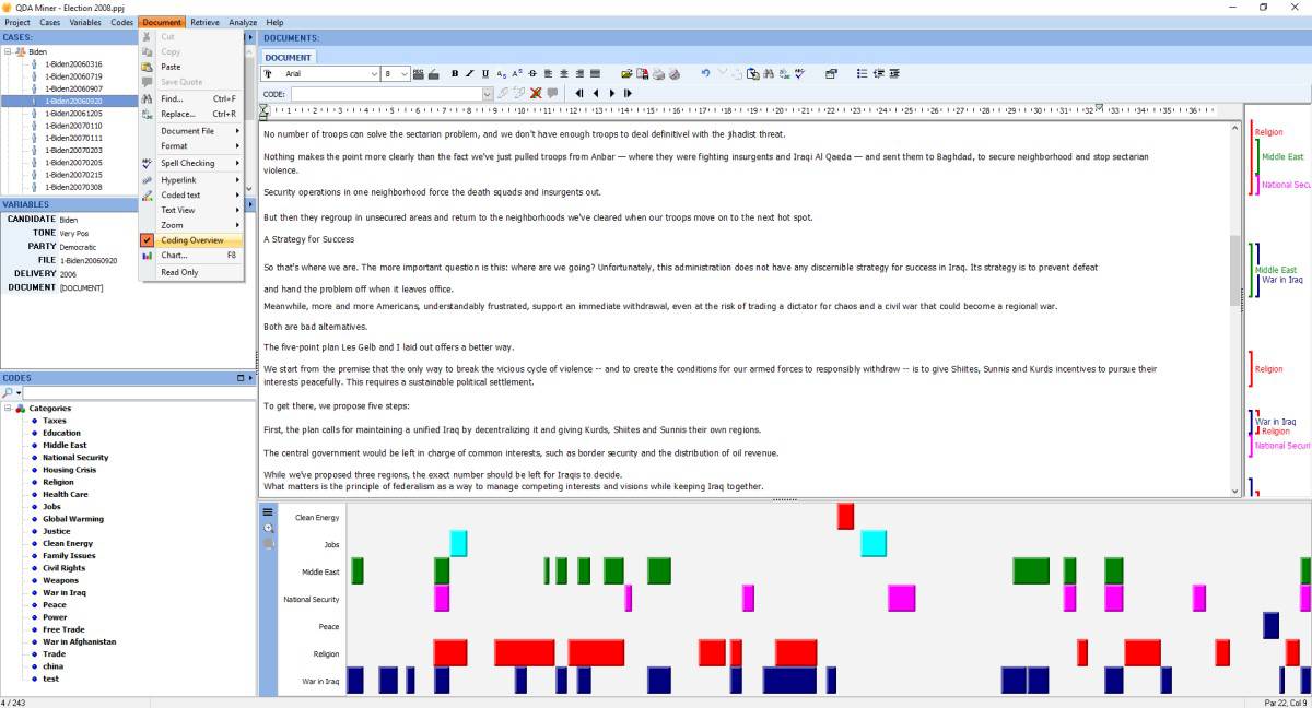
Once you click on Coding Overview a graphic of the spatial distribution of the coding will appear at the bottom of the screen. You can size it according to your needs.
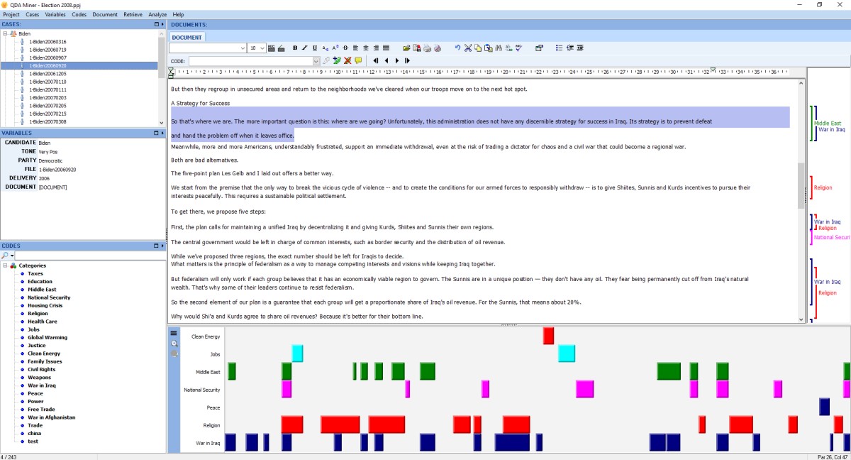
When you click on the codes in the graphic the corresponding text segment of the code will be highlighted.
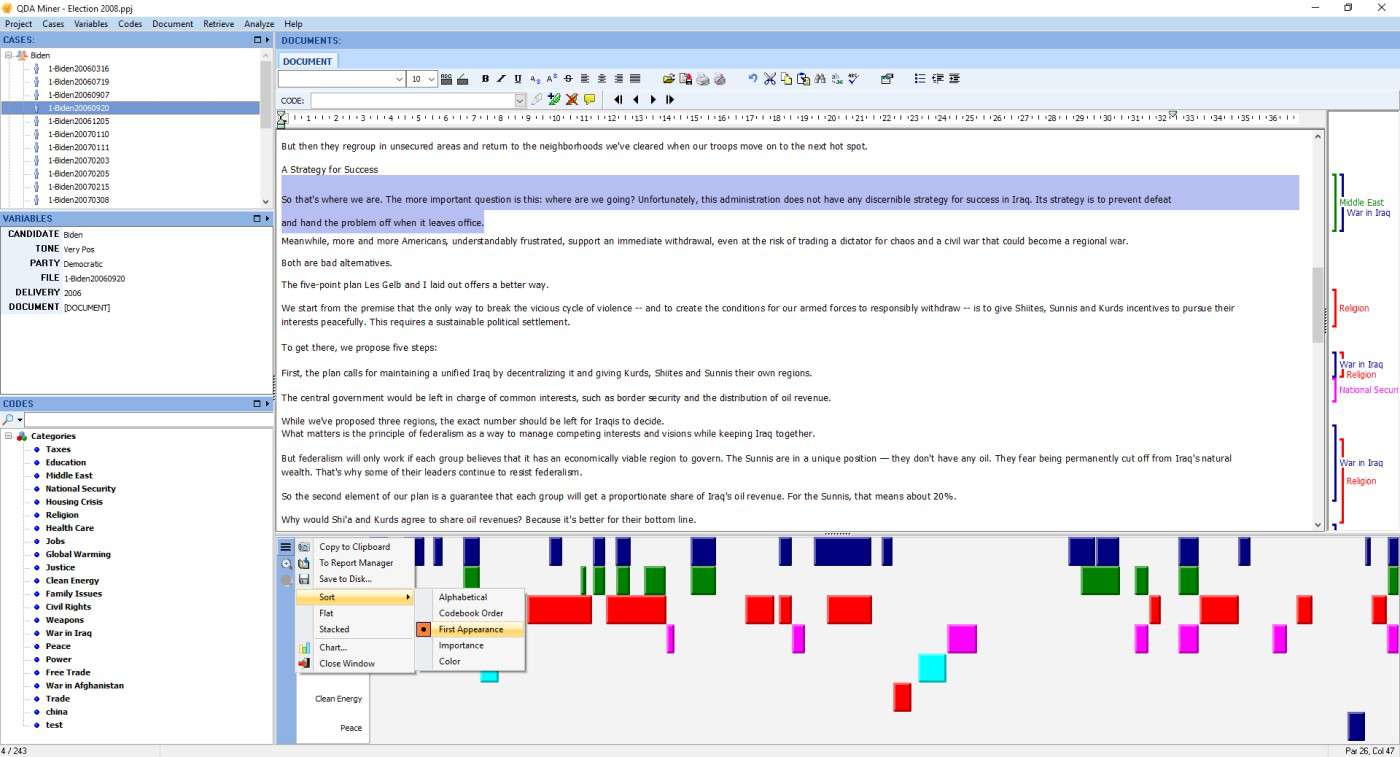
The code bars can be sorted alphabetically, by frequency, first appearance, in codebook order, or by color. You can also zoom in or out of the graphic display.
The codes may also be stacked to easily compare coding importance.
You can click on the menu above the zoom feature on the left of the Document Overview display and copy to clipboard, to report manager or save to disk.
Finally, in the same menu you can access the chart selection menu to create bar charts, pie charts and word clouds of the codes.
QDA Miner 5.0 is still in beta testing. It should be officially released very soon. You can find alerts for these blog posts if you follow us onTwitter, on Facebook or LinkedIn.
If you have other suggestions for ways we can help you with the presentation of your data please tell us by leaving a message on this blog.
Everyone who purchases QDA Miner 4 after June 1, 2016 will receive a free upgrade to QDA Miner 5.0