Easy to Use Chart Capabilities in QDA Miner 5: Chart Codes by Case September 27, 2016 - Blogs on Text Analytics
Charting your codes case by case and comparing them to other cases in your project is only a couple of clicks away in QDA Miner 5. It really is quick and easy! This blog is a follow-up to the one where we outlined the new Document Overview feature.
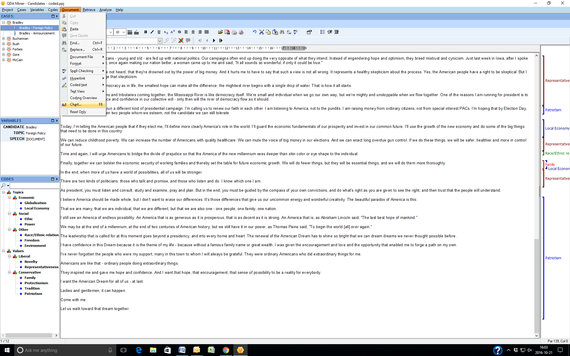
To begin charting the codes in each case, click on Document in the upper tool bar. Next, click on Chart in the drop down menu.
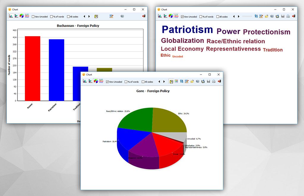
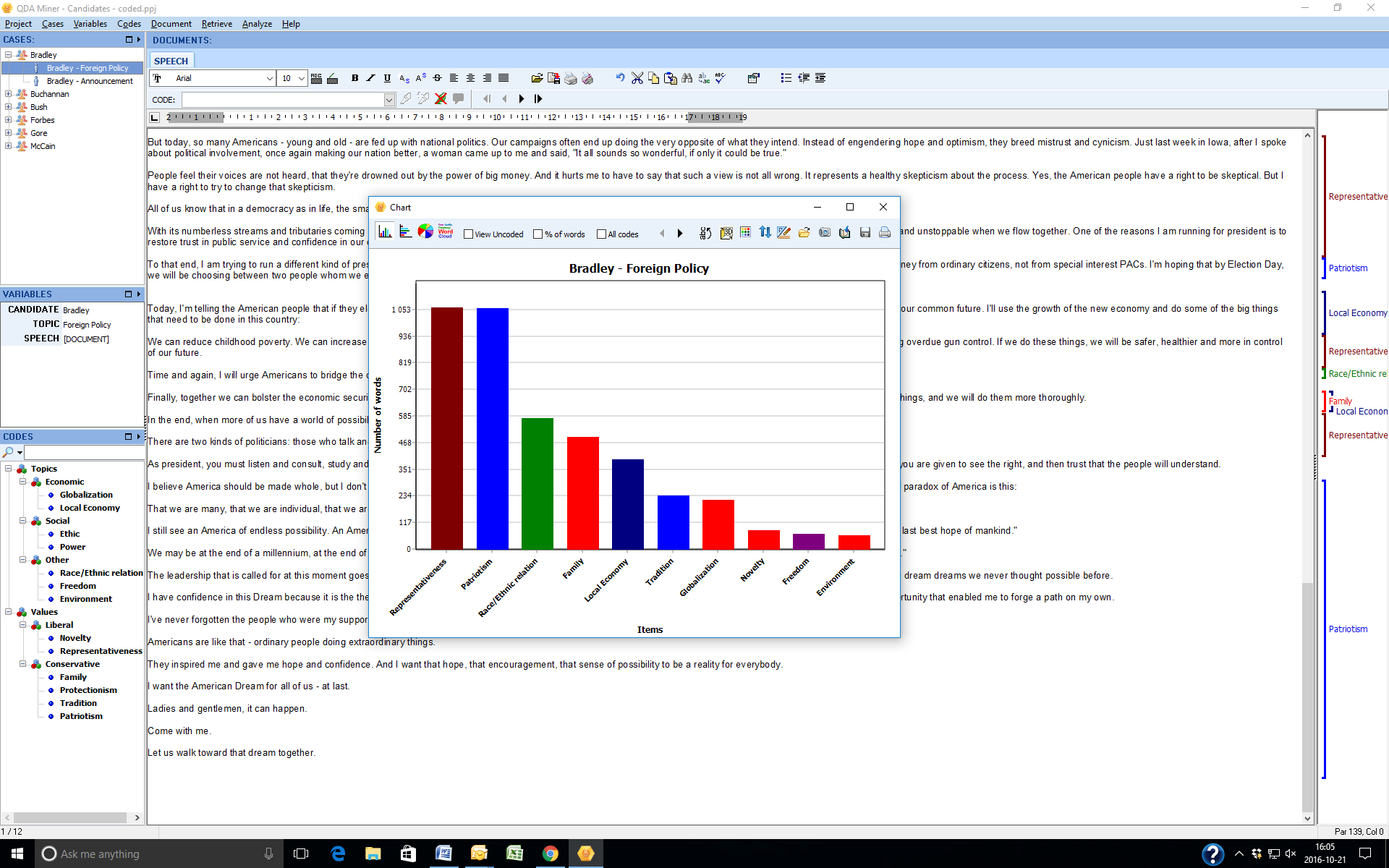
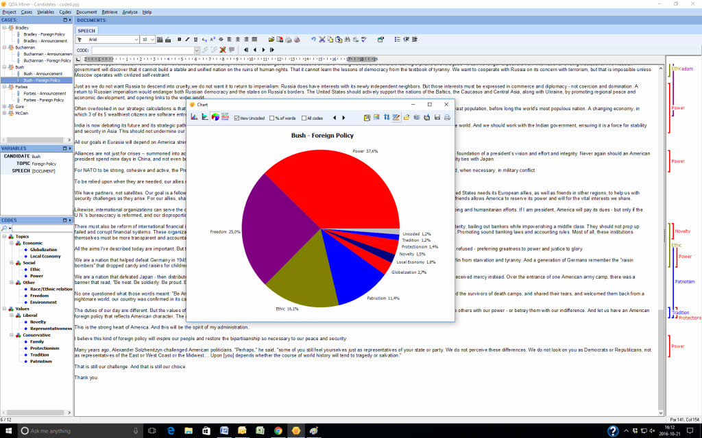
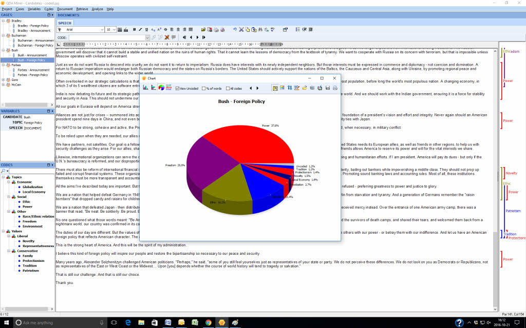
Once you do this you will get a bar chart showing the codes in relationship to each other and the number of words in the coded sections.
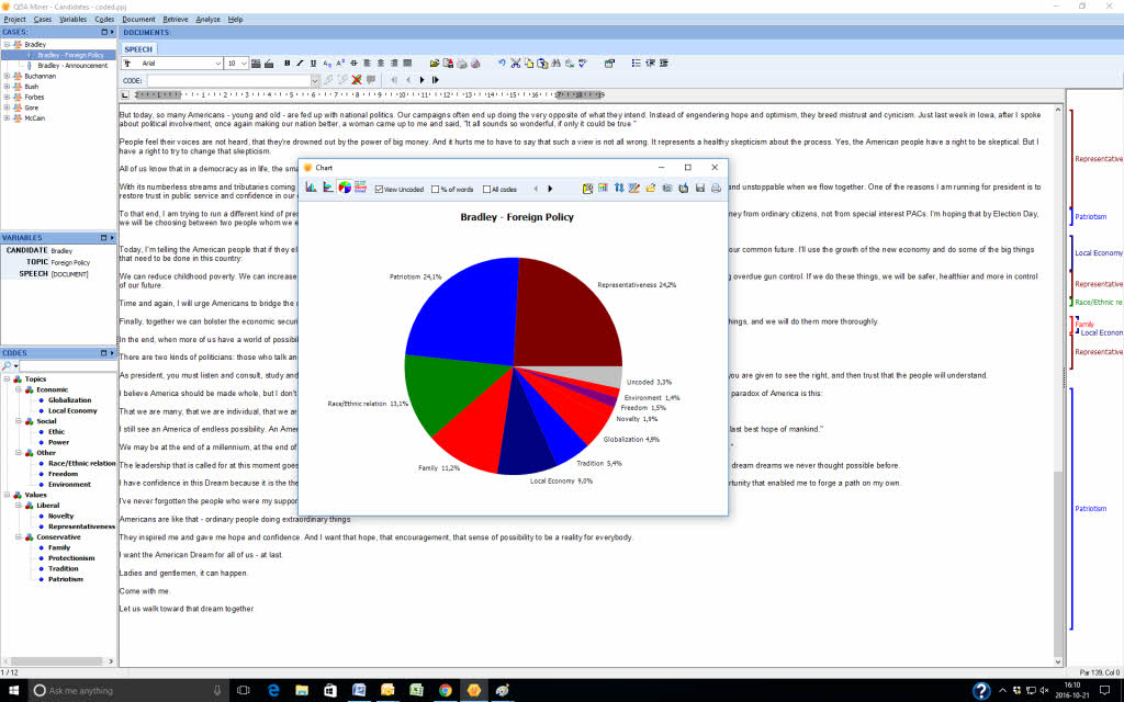
You can change the chart to a pie chart, horizontal bars or a word cloud by clicking on the icons on the top left of the screen.
You can also chart codes based on the percentage of words instead of the number of words or include the uncoded segment of the case in a bar chart, word cloud or pie chart by clicking in the uncoded box at the top of the screen.
The small black arrows at the top of the screen next to the All Codes box allow you to toggle between cases comparing the same chart.
You can also show all the charts in 3D by clicking on the 3D icon next to the black arrow.
You can save the charts to a disk, copy them to a clipboard or print them. QDA Miner 5.0 is currently in beta testing. It will be officially released shortly. You can find alerts for these blog posts if you follow us on Twitter, on Facebook or LinkedIn.
If you have other suggestions for ways we can help you with the presentation of your data please tell us by leaving a message on this blog.
Everyone who purchases QDA Miner 4 after June 1, 2016 will receive a free upgrade to QDA Miner 5.0