How We Analyzed U.S. Primary Debates with WordStat April 10, 2020 - Blogs on Text Analytics
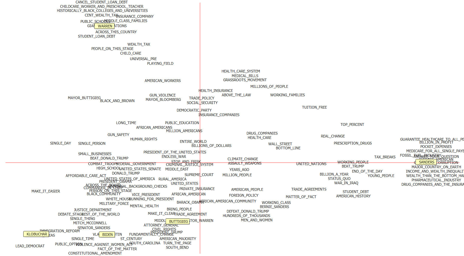
The 2020 Democratic primary elections are underway, and ‘Super Tuesday’ has put Biden in the lead following endorsements by withdrawn candidates Buttigieg and Klobuchar. You may have seen our tweet, showcasing the potential of text analytics to describe the debates and the candidates, in this case via a deviation table and correspondence analysis plot. We argued the endorsements can be explained in part by the similarities between the three centrist candidates.
Here it is again:
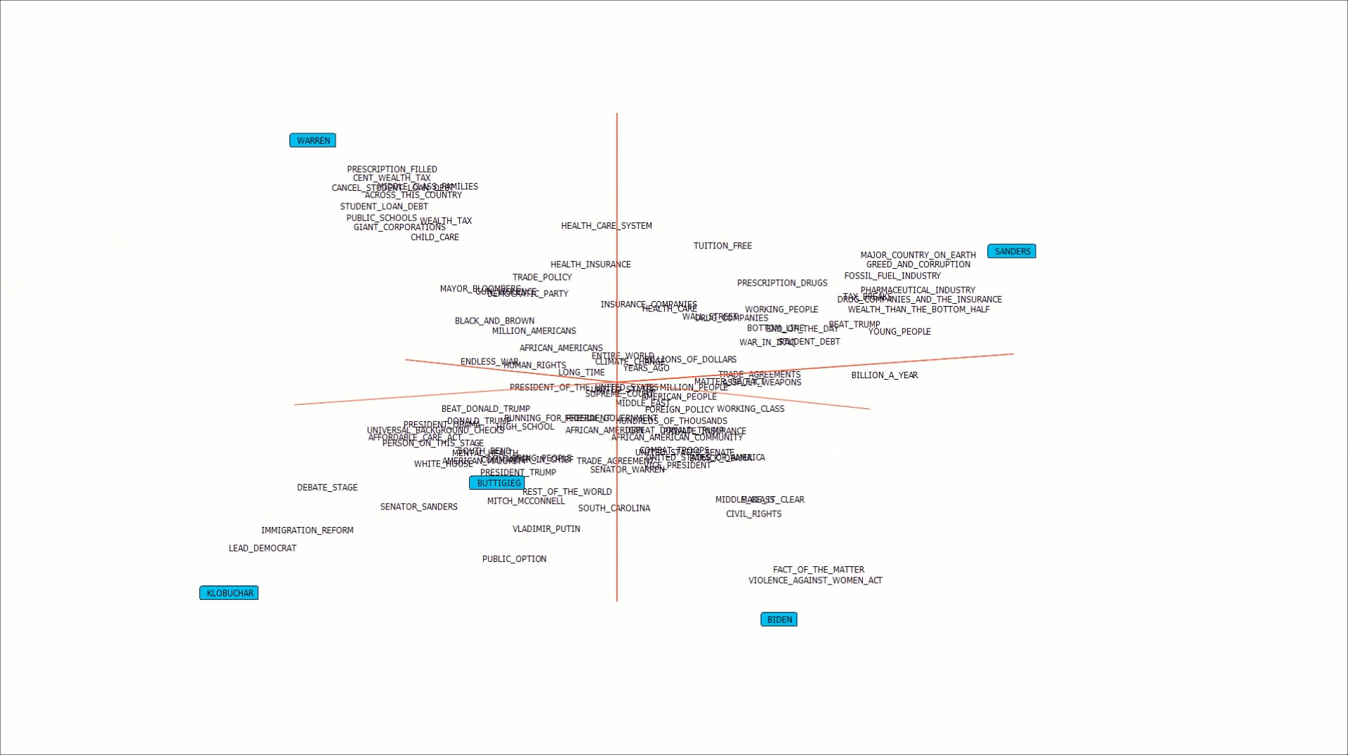
And with a 3rd axis.
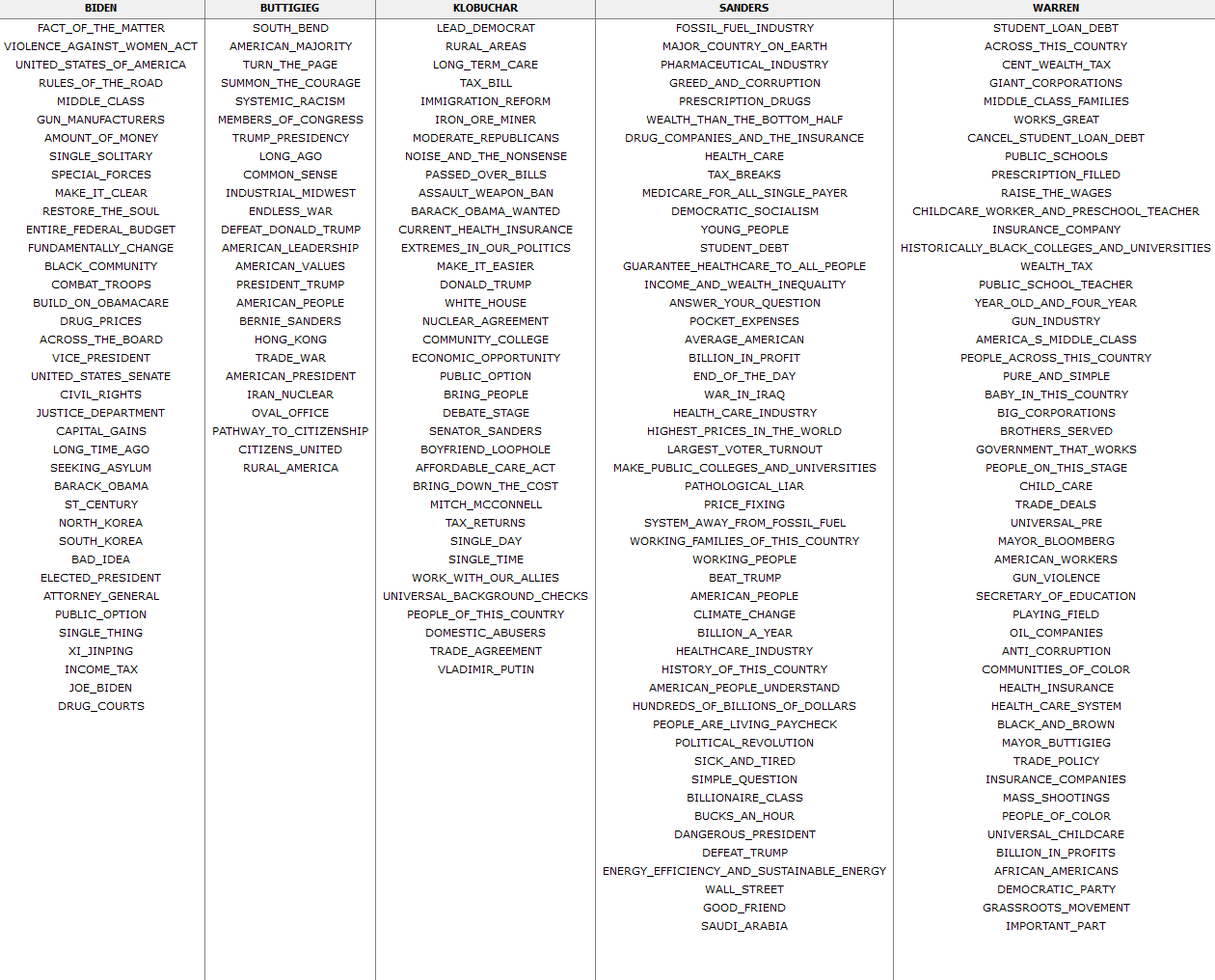
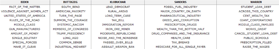
With Wordstat, you can also retrieve a deviation table of phrases that belong more to each candidate:
So how are these phrases sorted? Why do some candidates have fewer? And how is the correspondence plot generated? We wanted to provide you with a more technical explanation behind some of these methods as well as their common alternatives. In parts 2 and 3, we’ll look at how topic modeling and dictionary approaches can also help characterize the election. .
(These analyses were produced using transcript data from all the televised debates, up until February 25, 2020. We’ve limited ourselves to the 5 candidates who got the furthest, and filtered out questions by moderators and audience members.)
We can easily cross-tabulate two variables from our data (in our case, phrases and candidates) in Wordstat to start working with the contingency table needed for the output above. Now we have observed frequencies for each phrase by candidate.
But frequencies alone would be an inadequate measure of association. If there is a statistically significant association between phrases and candidates, such that you are more likely to hear an expression used by one over others, it would be revealed by a chi-square test of independence. If there is no significant relationship between the two variables, we could say that phrases are spoken in a way that is independent of who is speaking. This makes up our null hypothesis:
Ho: There is no association between phrase counts and candidates
The alternative hypothesis:
Ha: There is an association between phrase counts and candidates
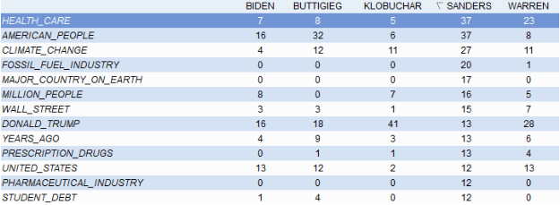
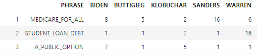
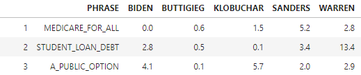
If the test shows significant association (defined below), we cannot accept the null hypothesis. Let’s use a smaller dataset to demonstrate the calculations required for the chi-square statistic. Here are the observed frequencies for ‘Medicare for all’, ‘Student loan debt’, and ‘A public option’.
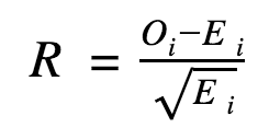
We get the chi- square statistic via this formula
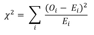
O: observed frequencies
E: Expected frequencies
Σ: summing over each i_cell
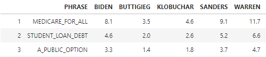
The expected frequency is what you would get under the null hypothesis (language use is independent of the candidates). Given how often a phrase is used in total and how many phrases a speaker uses, we can arrive at a value that is expected for each cell. The formula being:
Ei = (Phrasei total across candidates * Candidatei total across phrases)/ Grand Total
Here’s the same table with totals:
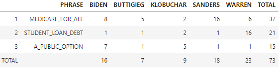
The expected frequency per cell is (37*16)/73 = 8.1…and so on
We need to “Σ” (sum up) all the (Oi_-Ei_)2/ Ei_cells, as per the formula above:
Which gives us 45.1
We can think of the values in the table above as a measure of how far off the data is from what we would expect (a distance that is squared, then weighted by the inverse of the expected value)
To determine whether 45.1 is significant enough to reject the null hypothesis, we compare it with a critical value found in the chi-square distribution table. We’ll need to calculate the degrees of freedom for this dataset (# of columns -1 * # of rows -1 =8), and establish a confidence level (Alpha= .05) to look up the right value.
Our chi-square test statistic of 45.1 is higher than the critical value of 21.955. Therefore, there is indeed a significant relationship between phrase counts and candidates (the alternative hypothesis).
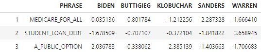
Some candidate phrases contributed more than others to our chi-square value, and to rejecting the null hypothesis of independence. In order to determine each cell’s contribution, we calculate the standardized residuals:
Any resulting values higher than 2 can be extracted for each candidate in order to illustrate what phrases are positively associated with them, as done in the deviation table above. Here are the standardized residuals of the toy dataset, showing Sanders highly associated to ‘Medicare for all’, Warren to ‘Student loan debt’ and both Klobuchar and Biden to ‘A public option’.
Comparing speech patterns across political candidates is a common analysis performed during election cycles and within the field of political science, with many other measures relied upon to characterize the candidates. Here’s a popular example from fivethirtyeight.com, employing a “Term Frequency – Inverse Document Frequency” measure to the 2016 primaries:
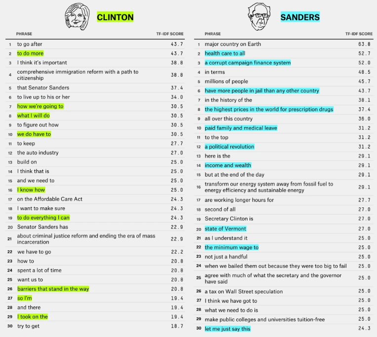
The various approaches might not produce drastically different results, but correspondence analysis and the standardized residuals differ from other measures (such as TF-IDF) in that we are extracting phrases that contribute the most to telling candidates apart. Combining term frequencies (a measure of popularity) with inverse-document frequencies (a measure of specificity) provides very elucidating results, and has extensive usage in information retrieval as a measure of representation. What our approach provides us with is a measure of discrimination. If we are interested in interrogating how a politician stands out from the rest and identifying what language is most associated to them in a unique manner, Wordstat’s deviation tables and correspondence plot is a very useful tool. Here again are the top ten positively associated phrases for each candidate, according to the standardized residuals:
Correspondence plot
A common approach to produce a plot during correspondence analysis is to perform a ‘Singular Value Decomposition’ (SVD) of the standardized residuals. SVD is a technique for dimensionality reduction. An analysis of hundreds or thousands of phrases and their use among 5 candidates cannot easily be visualized, unless we find a representation in two or three dimensions that illustrates the relations in the data.
A SVD solution finds three matrices, which multiplied together, recreate the data. Each phrase (rows) can be plotted by multiplying the left singular vectors with the second matrix’s diagonal vector of singular values (dots in the square matrix). The same singular values can be multiplied with the right singular vectors to plot candidate columns.
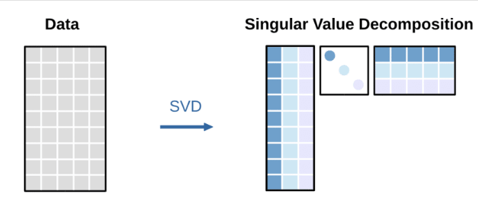
The data matrix to be decomposed can get quite large and quite sparse if we are analysing phrase counts, as among hundreds, some may never be used by certain candidates. SVD will arrive at a solution using the entirety of this matrix at once. It is computationally easier, and numerically equivalent, to arrive at the same plot, using “reciprocal averaging”. Correspondence analysis and reciprocal averaging are often referred to interchangeably, though one has its origins in the field of ecology, and the other among statisticians.
Repeat until scores converge:
Step 1: Assign random value to each phrase (word scores)
Step 2: Words scores are weighted by the observed frequencies
Step 3: Weighted average of word scores in each column (candidate) produces a candidate score
Step 4: Weighted average of candidate scores produces a new word score
Step 5: Standardize scores (subtract mean and divide by standard deviation)
Eventually this reciprocal averaging converges, and scores stabilize, allowing for coordinates on the first axis. The same steps can be followed for subsequent axes, adding an additional step of uncorrelating the scores from the first axis. This process is typically much faster than SVD when dealing with a large vocabulary, as counts of zero can be ignored and we are yielding one axis at a time.
Correspondence analysis provides insights into candidate similarity or word use similarity (proximity on the plot) as well as how discriminating an attribute is (distance from origin on the plot). We can interpret a level of association between words and candidates based on the standardized residuals, as well the size of the angle between both variables, measured by connecting word and candidate with lines to the origin.
If the focus of your analysis rests more on what themes were taken up during the debates, observing what groups of phrases or words were used together with some regularity regardless of candidate, topic modeling might be a more useful approach. The second part of this series will demonstrate what we can find in our debate corpus via topic modeling, and what are some common, unresolved pitfalls with this method.